- Category: logo
- Title: Kirsten Navin logo
- Client: Kirsten Navin
- Award: American Graphic Design - logo design
i before r
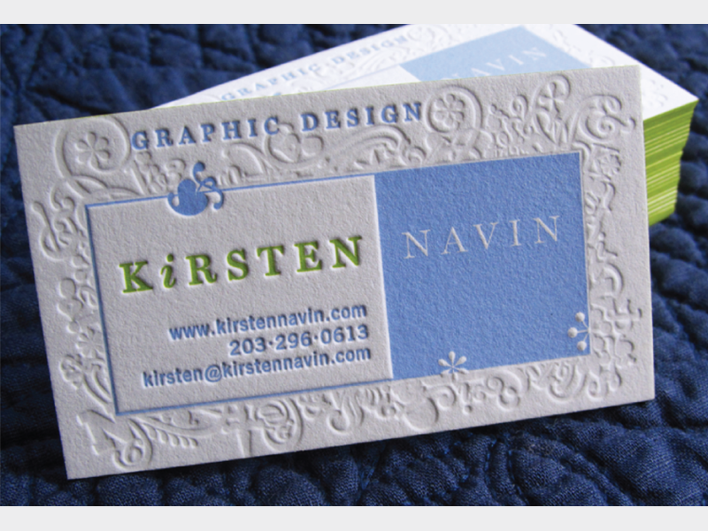
I’ve been drawn to letterpress since I first worked on a type specimen book in college. Something about rummaging through cases of metal type appeals to me. I wanted my mark to visually combine my interest in typography, my background in print, and my computer skills. The background looks as if a job case full of glyphs has spilled out. I then used an italicized “i” to emphasize the proper letter order of my name, because frequently “Kir” is mistakenly transposed to “Kri.” Despite my appreciation for the craftsmanship used to layout designs in letterpress, I must admit that working in Adobe Illustrator was significantly easier than locking up all the elements backwards, as would be necessary for traditional letterpress. My business cards are printed by letterpress using 2 inks, and one blind pass, plus the edging has been colored to match the vibrant green used in my name.


