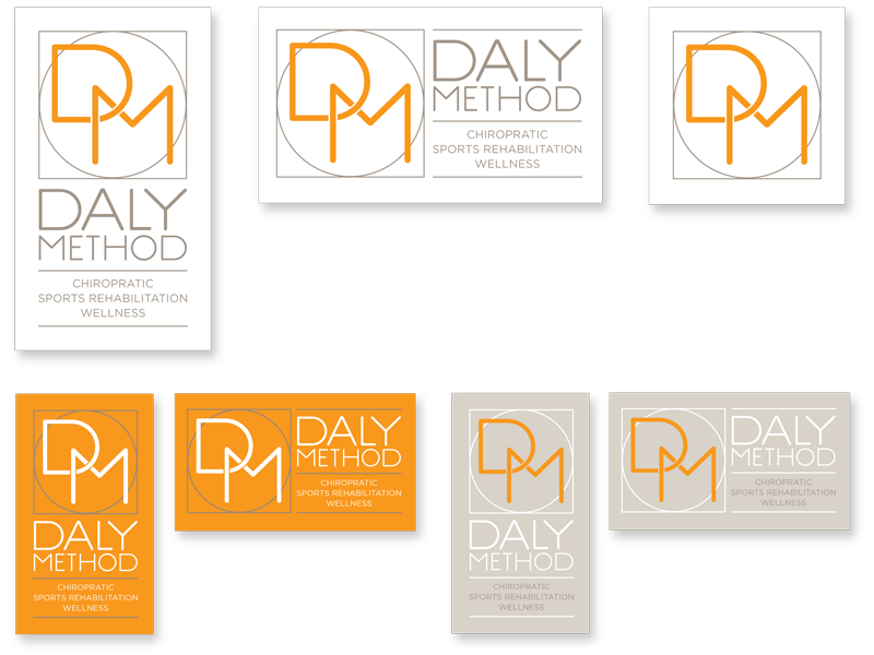
- Category: logo
- Title: Daly Method logo
- Client: Renee Daly
- Award: American Graphic Design - logo design
balancing act
The client requested a clean, modern logo design for her chiropractic practice. The company has a whole-health philosophy which includes chiropractic, wellness, and sports rehabilitation services. The circle within a square represents balance and alignment. The interlocking initials reinforces the whole-health/connectivity theme. A bright tangerine orange was selected as the primary color for its energy and vitality, which is then paired with an earthy warm gray as a calming balance. Also created front-end web designs and additional icons for their web site. Examples shown include the final vertical and horizontal logos and icon, as well as secondary color variations plus business cards and landing page.


